
Sunday 4/12
I was bored.
My wife and a friend were cooking all day, for the event the next Saturday. The dog got a long walk.
Hillary Clinton announced her campaign that day, and unveiled her now-famous mediocre logo. I shrugged. My first reaction was, it reminded me of the even more disastrous NBC letter N from the 1970s. And why is the arrow pointing to the right? Her campaign people should say, “The logo is looking out at you, and the arrow is pointing to its left.”
This may be why I haven’t worked on many political campaigns.
I went to bed.
Monday 4/13
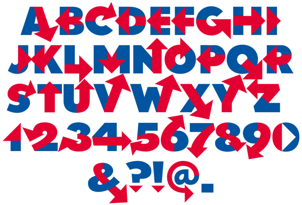
I opened Adobe Illustrator and drew an R for Rick, mimicking Hillary’s logo. I couldn’t figure out where to put the arrow. So my solution was, for some reason, to draw all the other 25 letters. I posted it: ”Hillary Bold: because, America. You’re welcome.” Actually, I went to Facebook and Google+ first. Twitter was an afterthought. Heh.
Immediately, Twitter started to respond. Remembering social media’s warning of how temporary a tweet is, I posted it twice more later in the day, the third time as a response to one of the articles about people’s discontent about Hillary’s logo. I didn’t read it.
I’ve tried to stay away from politics for years now, but this time, oddly, politics jumped the fence and was now in my backyard. Am I not entitled to an entry in this conversation? As I said to an encouraging friend, “Why not me?”
That night, a little after 10pm ET — 45 years to the minute after Apollo 13 exploded — my Twitter stream exploded!
The last thing I responded to that night was a suggestion for a better name for the font: Hillvetica. I sat there at the dining room table, and pulled the earbuds from my iPad, to play my wife the incessant alert pings, each one a retweet, like a digital popcorn popper. I had to turn them off to let her sleep, and soon followed her, wondering what would happen overnight, feeling like that woman who flew to South Africa, but in a good way.
Tuesday 4/14
Tsunami!
The first tweet had something like 1100 favorites and 1500 retweets, and counting! Then there were the retweets of retweets, comments, retweets of comments, all using my handle. I remembered the name Hillvetica, and realized with a headsmack: Hashtag! Ah, to be young and tweet-savvy, and remember to start with the hashtag! We all laugh as Fallon and Timberlake pepper conversations with them. Who’s laughing now?
My trending topic was now picked up by Talking Points Memo, Mashable, Fast Company, USA Today, and countless other outlets I’d have seen if I’d been monitoring properly, and not trying to wrap up my regularly scheduled freelancing.
When my wife came home, I listed all the outlets that had picked up my story, and she had only one response: “What are they paying you?” Supportive to the last, honey. Later, when the dust clears, though, that question will rise in my own brain, as if it were my own. There is a demand here, surely, but for what? But there’s no time for that now.
I wanted to produce an actual font, but wasn’t able to afford the software, since I got hit with a big tax bill and had to arrange for time payments today.
Wednesday 4/15
Tax returns made the mailbox. Whew.
A friend (you’ll hear lots of references to friends here, whom I’ll never take for granted again!) recommended Glyphs, a Mac-only font-making app, for $299. I started a GoFundMe page to raise it, promising to release the result as an open-source font (after all, the letter H was nominally a trademark, and I know not on whose toes I step), and offering the premium of a logo design for donations of $50 or more. I didn’t wait till the money came, but started to learn the 30-day free trial of Glyphs. A smart move, kind of.
I got an email (hey, the contact form on my website works! Whaddya know) from a guy who moonlights as a programmer, who would like to make a widget that arranges my letterforms into words to make little shareable GIFs. He’d like to use Hillary Bold. Already that day, without prompting, people were pulling down the tweeted image and crafting their own words, mostly anti-Hillary; a particularly well-crafted one, well-kerned, was the word BENGHAZI, still my favorite strictly from a design perspective. Where was he going to put this widget? Where he works during the day: as a business correspondent for the website of The Washington Post! May he? Um, yes, yes he may. By all means.
Then came a little dip in the roller-coaster ride: an email from an attorney from the owners of the venerable Helvetica typeface, recommending I not use the name Hillvetica. It wasn’t a problem, since I’d originally called it Hillary Bold. We agreed that the hashtag was beyond anyone’s control; that afterthought was now vital to the momentum of whatever tiger I had by the tail. And that I wouldn’t use the shape of Helvetica’s letters to make the font. I hadn’t. I’d actually … well, more on this later.
Oh, and Hillary Clinton herself tweeted using the Washington Post’s font widget! (More likely a staffer, but hey, let me have my mental picture.) Was this an imprimatur, or what? An approval, a legitimacy? ‘Twould seem so!
Thursday 4/16
The GoFundMe is up to $710. Oops! I had to stop it. I can’t afford too many logo designs at $50 apiece.
I’m sweating up the learning curve of Glyphs — not like mountain climbing, more like a steep hike — when I hit Dip Number Two.
The drawing of my font was dashed off swiftly, as you recall. That’s because I started with an existing font. Because for a joke, why redraw the freaking alphabet, am I right? I picked the one that most successful Democratic campaigns (YES WE CAN, etc.) have used: Gotham, from Hoefler. I thought I’d defaced it sufficiently with akimbo red arrows. But imagine, you wake up in the morning and recognize the remnant of a font you designed plastered all over your Twitter feed. It was a matter of time before Jonathan Hoefler himself reminded me of the difficulties I’d experience if I released the font in its current design. “Though hilarious.”
So, what to do? Some good friends in whom I confided recommended I stick to my guns. This is a parody, after all! And the courts have said you can’t copyright a font. And Hillary had already used it in that Washington Post widget, hadn’t she? But I still had the sense of urgency; this ride was moving fast, and I had to keep up, not wait perhaps weeks for lawyers, whom I’d have to start another GoFundMe to afford, even if I won. I opted for the step that would save me some respect in the eye of this eminent typographer: I redrew the letters, from scratch. And added numbers and some punctuation. When I related this on Facebook, there appeared a laundry list of requests for diacritical marks, circumflexes, umlauts, and all manner of ethnic geegaws. The !, ?, @ and period made it. I’ll probably add an apostrophe later. We’ll see.
I managed to finish this by a decent bedtime. I sent an image of this to Mr. Hoefler. I even made sure to spell “voilà” with an accent grave. Still no response.
Friday 4/17
The Washington Post guy grudgingly accepted the new letter shapes for his widget. My original Gotham-ish outlines were still the ones everyone’s retweeting, in the tens of thousands by now, in spite of my efforts. The enchanted brooms were still trying to fill the well. They still are today.
I’d been following a Glyphs tutorial on making a two-color font, one that was referred to me by a Twitter follower who uses the app. I already knew I needed to make a package of two fonts, with the text typed out in one and then in the other, each colored by the feature in whatever app is being used. (Part of the package will be a readme explaining all this.) After some calls for help in the Glyphs forum, I saw the problem: the tutorial was for version 2, which is what you get when you buy it. The 30-day trial gets you version 1. So I pulled the trigger with GoFundMe, which takes more than $60 commission. They advise you multiple times in the process how they calculate it, and I hit OK every time, so … OK. I then bought Glyphs 2.
In my Twitter stream appeared a chance to test my font: Would I follow Shawna Thomas, so she can PM me? Shawna works for NBC’s Meet the Press. I did so. Would I like to set some things in Hillary Bold tomorrow as graphics for Sunday’s show? Why yes, Shawna, yes I would. By all means.
This time, when my wife asked, “For pay?”, I gave serious thought to it, and promised this would be the last such freebie. It would probably be the last request for one, but what do I know? I’m holding on to the bar, not looking around the bend.
Saturday 4/18
They’d have the words sometime Saturday for me. But Saturday I had a long-term engagement at an event during which I would teach the not-at-all-irrelevant craft of medieval calligraphy. I’d be wearing period clothing. I’d be monitoring my iPad, anachronistically, all morning. When I got Shawna’s words, I hopped into the car, tried to type out the silly sayings with the font, which borked, then set them manually, make them into a PDF, emailed them, then returned to the event. Only missed a half hour of my three-hour session. I doubt any neighbors saw me dressed funny, but then, this is Philadelphia, and they probably thought I’d gotten a gig as Ben Franklin or something.
Sunday 4/19
Plotz day after a busy event for me and my wife, who cooked all day Friday and most of Saturday for the attendees. We’ve got our fridge back (mostly)!
I advised some to watch Meet the Press today on my behalf, because I don’t have a TV. People actually held their smartphones to their TVs and sent it to me, so I could see. That touched me deeply, for some reason. I have fans. I wonder what it would take for me to do that for someone else. And it turned out to be unnecessary.
Chuck Todd relayed my reasons for this stunt, that I’d emailed to Shawna (with whom, you’ll notice, I am now on a first-name basis): “I liked the idea of making people laugh through design, and I like that no one knows whether I did it because I support Ms. Clinton or I want to give ammunition to her detractors. It does both, because that’s the great thing about language.”
I finally discovered Twitter Analytics, which takes 24 hours to stew. I’ll revisit it today, and post results.
You are now caught up.
I’ll get more philosophical and future-minded in my next post.
The ride isn’t over yet!
Update
This is Hashtracking’s analytics for #Hillvetica on April 21: 8.4 million impressions!
And this doesn’t include the first three tweets that started the snowball, that are still being retweeted today, the ones I sent before I thought of the hashtag.
Proud of you, man.
[…] week, Designer Rick Wolff tweeted an image of Hillary Bold (#Hillvetica), his riff on the infamous Hillary ’16 […]