
Dealing with typography as long as I have, I can’t help but ponder the path from smudge on a paper (or clump of same-color pixels on a screen), to brain, to mouth, to ear. Languages that are offshoots of Latin and Greek use each smudge (glyph) to symbolize a single sound, either a consonant or a vowel. This keeps the list of glyphs very short, with complexity gained by stringing the letters together in sequence. Other languages, like Japanese, have each glyph symbolize a syllable, a combination of one consonant and one vowel (a syllabary language). Now there are considerably more glyphs, but words are shorter. This is suitable to spoken Japanese, which doesn’t have more than one consonant in a row (which is why their adaptation of the English word baseball is besuboru, four syllables). Then there’s a language like Chinese, where each symbol is a word (logogram), and there are a bazillion glyphs, and no one knows completely how to write in Chinese.
Each of these kinds of glyph-to-sound systems has its cultural heritage, and are favored by different speakers. But one thing is for sure: any of these alphabets are made easier to learn if what you do to one letter to make another letter were consistent. Take English words, for instance. Latin and Greek gave us the prefix and suffix. Take an adjective, and add one of only a few prefixes (un-, de-, anti-), and you have the adjective with the opposite meaning. (Esperanto strove to limit such prefixes to one.) Why don’t we do that with letters/glyphs?
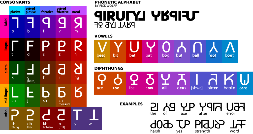
I’m talking about a streamlined version of the International Phonetic Alphabet. Our labial plosive (made by popping air out the lips) is P. When we voice during it, it comes out as B. So, you’d figure, the “rule” to symbolize voice is a little loop on the lower right quadrant of the letter. You’d figure wrong. The lingual plosive (popping air from between tongue-tip and roof of your mouth) is T, but voiced, it’s D: a big old loop. And what’s up with K and G? Or CH (one sound, two letters) and J?
There are ancient reasons why those letters make those sounds. But what if, just for the exercise, we had rules that made similar sounds have similar symbols? You’d have what you see in the drawing at right. Voicing a plosive? Just draw another horizontal line halfway down. Notice the relation not only between P and B, but P and T; you can imagine already what other plosives, like K, will look like.
Vowels and diphthongs have a similar approach. They’re all bi-symmetrical. The farther forward the vowel is pronounced in the mouth (like the ee in beet), the higher up the glyph are the details, and vice-versa. The simplest in form are the classic Latin I E A O U, with other formations in between.
Yes, I know, there are some cheats. Strictly speaking, L isn’t nasal. But I needed to fit it in somewhere. Likewise H and R aren’t great fits. (Sue me. Get your own alphabet.)
Some examples of words are at the bottom of the image of the full alphabet. I’m a fan of ligatures, so long as they don’t obscure the identity of the conjoined glyphs.
This design lends itself to existing typefaces. The one I used in this chart is based on Myriad.
An example of the geeky stuff I think about sometimes. Feel free to play with it, and let me know what you come up with. Or improve on it.
Postscript, February 2023
I found two Subreddits, one for invented languages (conlangs), and one for invented glyphic systems (neography). This is evidence I’d been doing the latter before I ever joined Reddit.
I’ve had thoughts like this before (though I’m by no means a designer). In some ways, though, related sounds looking dissimilar is frequently a *feature* rather than a bug, especially for people who speak non-standard dialects and/or people who have issues like dyslexia. As an American, I pronounce “subtle” like “suddle”… if the symbols resembled one another, I’m not sure I’d ever have learned spelling! Not a bad idea in the IPA world, though, where people are presumed to have a more abstract understanding of the differences.
When I was a teenage fanboy, I made an intensive study of the alphabets Tolkien devised for LOTR, which are, as a matter of fact, designed very much along the lines you describe. “Most letters are constructed by a combination of two basic shapes: a vertical stem (either long or short) and either one or two rounded bows (which may or may not be underscored, and may be on the left or right of the stem).” https://en.wikipedia.org/wiki/Tengwar#Letters
I always thought that made an awful lot of sense.
I have half a mind, once I’m through with Hillary Bold and Valentine, to develop a font that accomplishes this, or several in different styles (serif, sans-serif, cursive, calligraphic).
Thank you for the contribution.