
“The best days of Starbucks are ahead of us.” So gushes the seemingly undercaffeinated Starbucks CEO Howard Schultz in the company’s announcement of the unveiling of their new logo. Like the MTV logo last year, it’s not much more than a crop job. The name that explained who the company is can now be excluded. The message: if you have to ask, you’re hopelessly backward.
Here are my predictions for future Starbucks logos. Study them while you can.
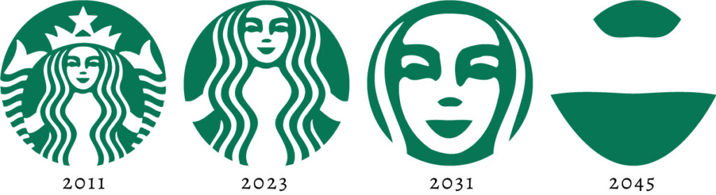
Epilogue, February, 2023
I have since seen the “2023” version, I forget where. Right on schedule.
Also, I’ve learned a bit more about mermaids. The original anatomy of a mermaid had her legs represented as two tails, with female human anatomy between. Hence the suggestion of spread twin tails in the early Starbucks logo. When you think about it, what’s the sense of a sex-starved seaman hallucinating such a chaste creature as we see in Disney movies?
Hilarious! Almost begs to have a follow-up about all of the copycats and where they would be down the road. I think a well-designed logo should lose value if you add or remove elements from it.
By 2043 – it looks like they’ve merged with TBS. Funny – Very Funny…and Caffeinated!
Markets change. What might have been a well-designed logo in the past sometimes needs an update to reflect this/reposition brand with new realities. In general I see nothing wrong with this if the risk of alienating existing brand value is avoided.
AWESOME!!
Fergus, you’re right. Generally, I like the effect: a brand no longer feeling it needs the peripheral justifications, and trims the metaphorical crust from the bread. It’s good to do if it’s reached a level of familiarity. Likewise, doing this demonstrates a company’s level of awareness of how familiar it is. They know they’re “all that.”
Reed, I suppose I should’ve done a post putting other logos through the same process. Would the Kraft logo be “RAF”? Feel free to run with it!
Very funny! I am not a fan of the new logo; to me the middle part is the least important. They dropped what I recognized as Starbucks and kept a very miniscule piece of it. Can’t wait for 2043!
I think you are spot on for 2043. 😉